The Marketing G: a daily letter, free tools, and no marketing theatre.
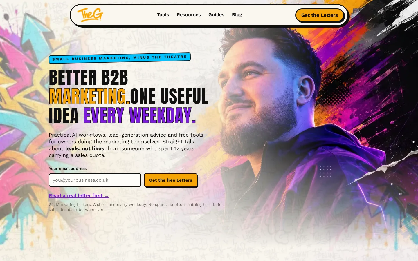
This one is mine. A personal brand for the marketing side of what I do: a letter every weekday for B2B owners doing their own marketing, a set of free tools and guides, and an identity that could not be mistaken for anyone else's.
- Sector
- B2B marketing, small business
- Built
- Site, newsletter, tools, guides, industry pages
- Stack
- Astro, static, newsletter on Beehiiv
The brief I gave myself.
Twelve years carrying a B2B sales quota, then marketing. The thing I kept seeing was owners being sold theatre: jargon, vanity metrics and retainers that kept them busy and broke. The site had to be the opposite, so the rule was simple: nothing on it is for sale. Every page gives something away, and the only ask is an email address for the letter.
What was built.
The letter. One useful idea, every weekday, under five minutes to read. The homepage leads with it, shows a real letter before asking for an email, and says in plain words that there is no pitch. The list runs on Beehiiv with a native form on the page and the original form as a fallback.
The tools. A pipeline calculator that works out how many conversations a month a business actually needs, a marketing source-of-truth document built by an interview prompt, a weekly scorecard of the six numbers that predict sales, and a swipe file of live lead magnets dissected line by line. Each one is a page you can use without signing up.
The guides. Five long playbooks that everything else on the site feeds into: hiring marketing help, AI marketing, lead generation, lead magnets and measuring marketing. Then a blog for the shorter pieces, and a set of pages for the industries I have sold into, from accountants to engineering firms.
The identity. A portrait over a spray-paint illustration, a condensed display face, and a yellow button. It is loud on purpose. The audience is owners who have seen a thousand navy-and-white agency sites, and the brand had to look like a person, not a firm.
Why it is shaped this way.
A personal brand earns trust by giving things away before asking for anything, so the navigation is Tools, Resources, Guides, Blog, and one button for the letter. There is no services page. The site is built in Astro and served as static files, so every page loads in well under a second and there is nothing to maintain, which matters when the person maintaining it also has to write a letter every weekday.
It is also the working example behind the SEO and GEO andAI for marketing services here: answer-first pages, named authorship, structured data, and a content pipeline that turns one conversation into a week of material.
What I would tell anyone building their own.
- Decide what the site gives away before you decide what it looks like. The look follows.
- One call to action. If the letter is the ask, everything else is a gift.
- Make the tools real pages, not gated PDFs. People share pages.
- Look like yourself. The safest design is the one nobody remembers.
A site with a point of view, in a week.
A site of this size is more than one sprint, and I would tell you that on the call. The first sprint still starts on a Tuesday.
Free · no obligation · I’ll tell you straight if it isn’t a fit